Button 按钮
介绍
按钮用于触发一个操作,如提交表单。
TIP
阅读该组件文档前请确保已认真阅读快速上手章节的每一个字。
引入
ts
import { IBestButton } from "@ibestservices/ibest-ui";代码演示
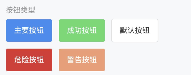
按钮类型
TIP
按钮支持 default、primary、success、warning、danger 五种类型,默认为 default。
点我查看代码
ts
@Entry
@Component
struct DemoPage {
build() {
Flex({ wrap: FlexWrap.Wrap, space: {main: LengthMetrics.vp(12), cross: LengthMetrics.vp(12)} }) {
IBestButton({
text: '主要按钮',
type: 'primary'
})
IBestButton({
text: '成功按钮',
type: 'success'
})
IBestButton({
text: '默认按钮',
type: 'default'
})
IBestButton({
text: '危险按钮',
type: 'danger'
})
IBestButton({
text: '警告按钮',
type: 'warning'
})
}
}
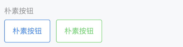
}朴素按钮
TIP
通过 plain 属性将按钮设置为朴素按钮,朴素按钮的文字为按钮颜色,背景为白色。
点我查看代码
ts
@Entry
@Component
struct DemoPage {
build() {
Row({ space: 12 }) {
IBestButton({
text: '朴素按钮',
type: 'primary',
plain: true
})
IBestButton({
text: '朴素按钮',
plain: true,
type: 'success'
})
}
}
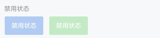
}禁用状态
TIP
通过 disabled 属性来禁用按钮,禁用状态下按钮不可点击。
点我查看代码
ts
@Entry
@Component
struct DemoPage {
build() {
Row({ space: 12 }) {
IBestButton({
text: '禁用状态',
type: 'primary',
disabled: true
})
IBestButton({
text: '禁用状态',
type: 'success',
disabled: true
})
}
}
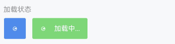
}加载状态
TIP
通过 loading 属性设置按钮为加载状态,加载状态下默认会隐藏按钮文字,可以通过 loadingText 设置加载状态下的文字。
点我查看代码
ts
@Entry
@Component
struct DemoPage {
build() {
Row({ space: 12 }) {
IBestButton({
loading: true,
type: 'primary',
})
IBestButton({
text: '加载状态',
loadingText: '加载中...',
type: 'success',
loading: true
})
}
}
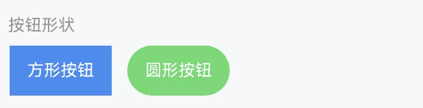
}按钮形状
TIP
通过 square 设置方形按钮,通过 round 设置圆形按钮。
点我查看代码
ts
@Entry
@Component
struct DemoPage {
build() {
Row({ space: 12 }) {
IBestButton({
text: "方形按钮",
type: "primary",
square: true,
});
IBestButton({
text: "圆形按钮",
type: "success",
round: true,
});
}
}
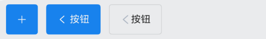
}图标按钮
TIP
通过 iconBuilder 插槽设置按钮图标。
点我查看代码
ts
@Entry
@Component
struct ButtonPage {
@Builder Arrow(){
Image($r('app.media.title_back'))
.width(16)
}
build(){
Row({ space: 12 }) {
IBestButton({
type: 'primary',
icon: 'plus'
})
IBestButton({
text: '按钮',
type: 'primary',
iconPosition: "right",
icon: 'arrow'
})
IBestButton({
text: '按钮',
type: 'primary',
iconPosition: "top",
icon: $r('app.media.app_icon')
})
IBestButton({
type: 'primary',
text: '按钮',
iconPosition: "bottom",
iconBuilder: (): void => this.Arrow()
})
}
}
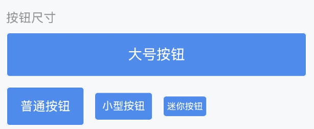
}按钮尺寸
TIP
支持 large、normal、small、mini 四种尺寸,默认为 normal
点我查看代码
ts
@Entry
@Component
struct ButtonPage {
build(){
Row({ space: 12 }) {
IBestButton({
text: '大号按钮',
type: 'primary',
buttonSize: 'large'
})
IBestButton({
type: 'primary',
text: '普通按钮',
})
IBestButton({
text: '小型按钮',
type: 'primary',
buttonSize: 'small'
})
IBestButton({
text: '迷你按钮',
type: 'primary',
buttonSize: 'mini'
})
}
}
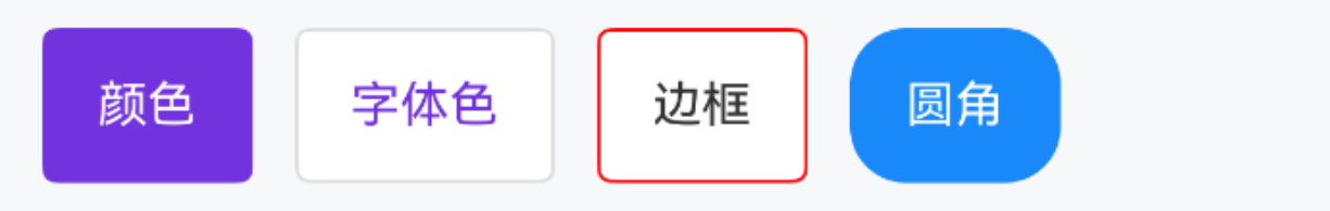
}自定义样式
TIP
通过 color 属性可以自定义按钮的颜色。
点我查看代码
ts
@Entry
@Component
struct ButtonPage {
  build(){
    Row({space: 12}) {
      IBestButton({
        text: '颜色',
        color: "#7232dd"
      })
      IBestButton({
        text: '字体色',
        fontColor: "#7232dd"
      })
      IBestButton({
        text: '边框',
        btnBorder: {
          width: 2,
          color: "red",
          style: BorderStyle.Dashed,
          radius: 16
        }
      })
      IBestButton({
        type: "primary",
        text: '圆角',
        btnBorderRadius: 16
      })
    }
  }
}
自定义大小
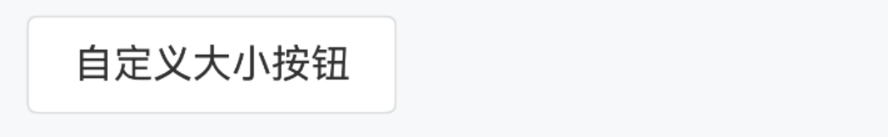
TIP
通过 btnWidth btnHeight 属性可以自定义按钮的大小, btnFontSize 属性可设置按钮文字大小。
点我查看代码
ts
@Entry
@Component
struct ButtonPage {
  build(){
    IBestButton({
      text: "自定义大小按钮",
      btnWidth: 150,
      btnHeight: 40,
      btnFontSize: 16
    })
  }
}
API
@Props
| 参数 | 说明 | 类型 | 默认值 |
|---|---|---|---|
| type | 类型,可选值为 primary success warning danger | string | default |
| buttonSize | 尺寸,可选值为 large small mini | string | normal |
| btnWidth | 按钮宽度,不写的话则使用 buttonSize 尺寸 | string | number | - |
| btnHeight | 按钮高度,不写的话则使用 buttonSize 尺寸 | string | number | - |
| btnFontSize | 按钮文字大小,不写的话则使用 buttonSize 尺寸 | string | number | - |
| text | 按钮文字 | ResourceStr | '' |
| color | 按钮颜色 | ResourceColor | |
| iconPosition | 图标展示位置,可选值为 left right top bottom | string | left |
| plain | 是否为朴素按钮 | boolean | false |
| square | 是否为方形按钮 | boolean | false |
| round | 是否为圆形按钮 | boolean | false |
| disabled | 是否禁用按钮 | boolean | false |
| hairline | 是否使用细边框 | boolean | false |
| loading | 是否显示为加载状态 | boolean | false |
| loadingText | 加载状态提示文字 | ResourceStr | '' |
| loadingSize | 加载图标大小,如果为-1 默认跟随字体大小 | string | number | -1 |
| icon | 按钮图标 | ResourceStr | - |
| fontColor | 按钮文字颜色 | ResourceColor | - |
| btnBorderColor | 按钮边框颜色,优先级高于btnBorder | ResourceColor | - |
| btnBorderRadius | 按钮圆角,优先级高于btnBorder | Length | BorderRadiuses | LocalizedBorderRadiuses | - |
| space | 文字与图标间距 | string | number | 4 |
| fontWeight | 文字字重 | string | number | FontWeight | Normal |
| btnPadding | 按钮内边距 | Length | Padding | LocalizedPadding | {left: 15, right: 15, top: 0, bottom: 0} |
| stateEffect | 是否开启按压态 | boolean | true |
| btnBorder | 按钮边框 | BorderOptions | - |
Events
| 事件名 | 说明 | 事件类型 |
|---|---|---|
| onBtnClick | 点击按钮的回调事件,按钮状态不为加载或禁用时触发 | () => void |
插槽
| 插槽名 | 说明 | 类型 |
|---|---|---|
| defaultBuilder | 按钮内容的插槽,使用该插槽后将完全接管按钮内容,其余插槽均失效 | CustomBuilder |
| iconBuilder | 按钮图标的插槽,loading为true时,将显示loading图标 | CustomBuilder |
| loadingIconBuilder | loading 状态的图标,使用该插槽将替换默认的 loading 图标 | CustomBuilder |