Dialog 弹出框
介绍
弹出模态框,常用于消息提示、消息确认,或在当前页面内完成特定的交互操作。支持组件调用和函数调用两种方式。
TIP
阅读该组件文档前请确保已认真阅读快速上手章节的每一个字。
引入
ts
import { IBestDialogUtil, IBestDialog } from "@ibestservices/ibest-ui";代码演示
提示弹窗
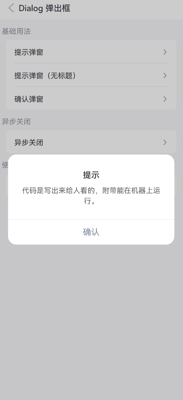
TIP
用于提示一些消息,默认只包含一个确认按钮。
点我查看代码
ts
@Entry
@Component
struct DemoPage {
build(){
Column(){
IBestButton({
text: '打开弹窗',
type: 'primary',
onBtnClick: () => {
IBestDialogUtil.open({
title: "提示",
message: "代码是写出来给人看的,附带能在机器上运行。",
onConfirm: () => {
console.log("点击确定")
}
})
}
})
}
}
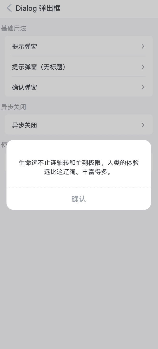
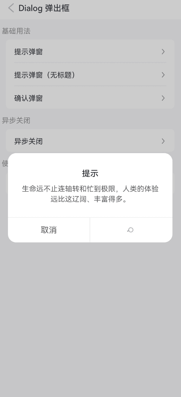
}提示弹窗(无标题)
点我查看代码
ts
@Entry
@Component
struct DemoPage {
build(){
Column(){
IBestButton({
text: '打开弹窗',
type: 'primary',
onBtnClick: () => {
IBestDialogUtil.open({
message: "生命远不止连轴转和忙到极限,人类的体验远比这辽阔、丰富得多。"
})
}
})
}
}
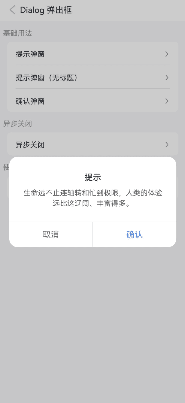
}确认弹窗
点我查看代码
ts
@Entry
@Component
struct DemoPage {
  build(){
    Column(){
      IBestButton({
        text: '打开弹窗',
        type: 'primary',
        onBtnClick: () => {
          IBestDialogUtil.open({
            title: "提示",
            message: "生命远不止连轴转和忙到极限,人类的体验远比这辽阔、丰富得多。",
            showCancelButton: true
          })
        }
      })
    }
  }
}
圆角按钮样式
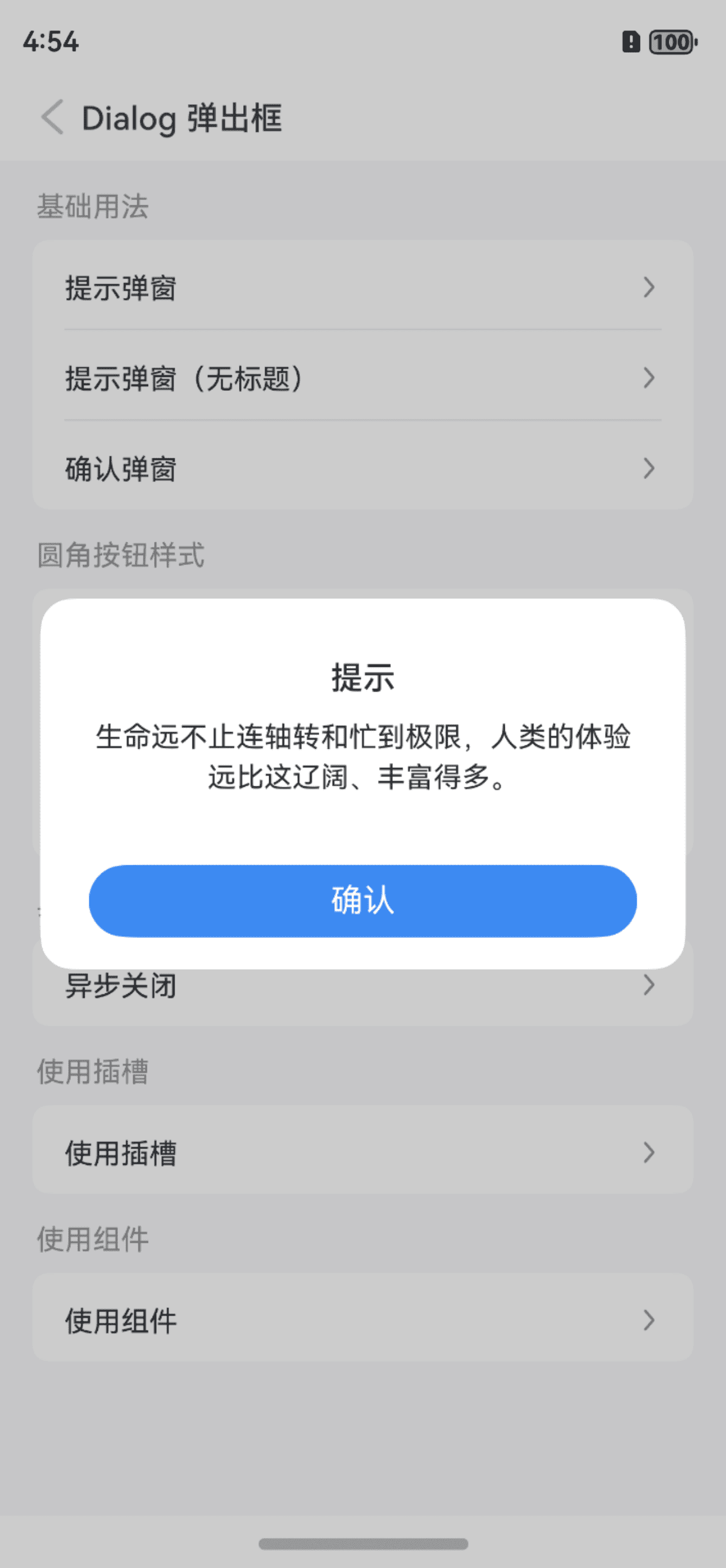
TIP
通过 theme 属性设置弹窗主题,可选值为 default(默认)、round-button(圆角按钮);
通过 buttonSpace 属性可设置底部按钮间距, 仅 round-button 模式有效。
点我查看代码
ts
@Entry
@Component
struct DemoPage {
  build(){
    Column(){
      IBestButton({
        text: '圆角按钮样式',
        type: 'primary',
        onBtnClick: () => {
          IBestDialogUtil.open({
            title: "提示",
            message: "生命远不止连轴转和忙到极限,人类的体验远比这辽阔、丰富得多。",
            theme: "round-button"
          })
        }
      })
    }
  }
}
背景图片

点我查看代码
ts
@Entry
@Component
struct DemoPage {
  @Builder imageBgBuilder() {
    Column()
      .height(200)
  }
  build(){
    Column(){
      IBestCell({
        title: '背景图片',
        isLink: true,
        hasBorder: false,
        onCellClick: () => {
          IBestDialogUtil.open({
            bgImage: "https://img0.baidu.com/it/u=3217812679,2585737758&fm=253&fmt=auto&app=138&f=JPEG?w=889&h=500",
            showConfirmButton: false,
            defaultBuilder: () => this.imageBgBuilder(),
            closeOnClickOverlay: true
          })
        }
      })
    }
  }
}
异步关闭
TIP
通过 beforeClose 属性可以传入一个回调函数,在弹窗关闭前进行特定操作。
点我查看代码
ts
@Entry
@Component
struct DemoPage {
build(){
Column(){
IBestButton({
text: '打开弹窗',
type: 'primary',
onBtnClick: () => {
IBestDialogUtil.open({
title: textData.title,
message: textData.life,
showCancelButton: true,
beforeClose: (action) => {
if(action == "confirm"){
return new Promise(resolve => {
IBestDialogUtil.open({
title: "提示",
message: "确认关闭?",
showCancelButton: true,
onConfirm: () => {
resolve(true)
},
onCancel: () => {
resolve(false)
}
})
})
}
return true
}
})
}
})
}
}
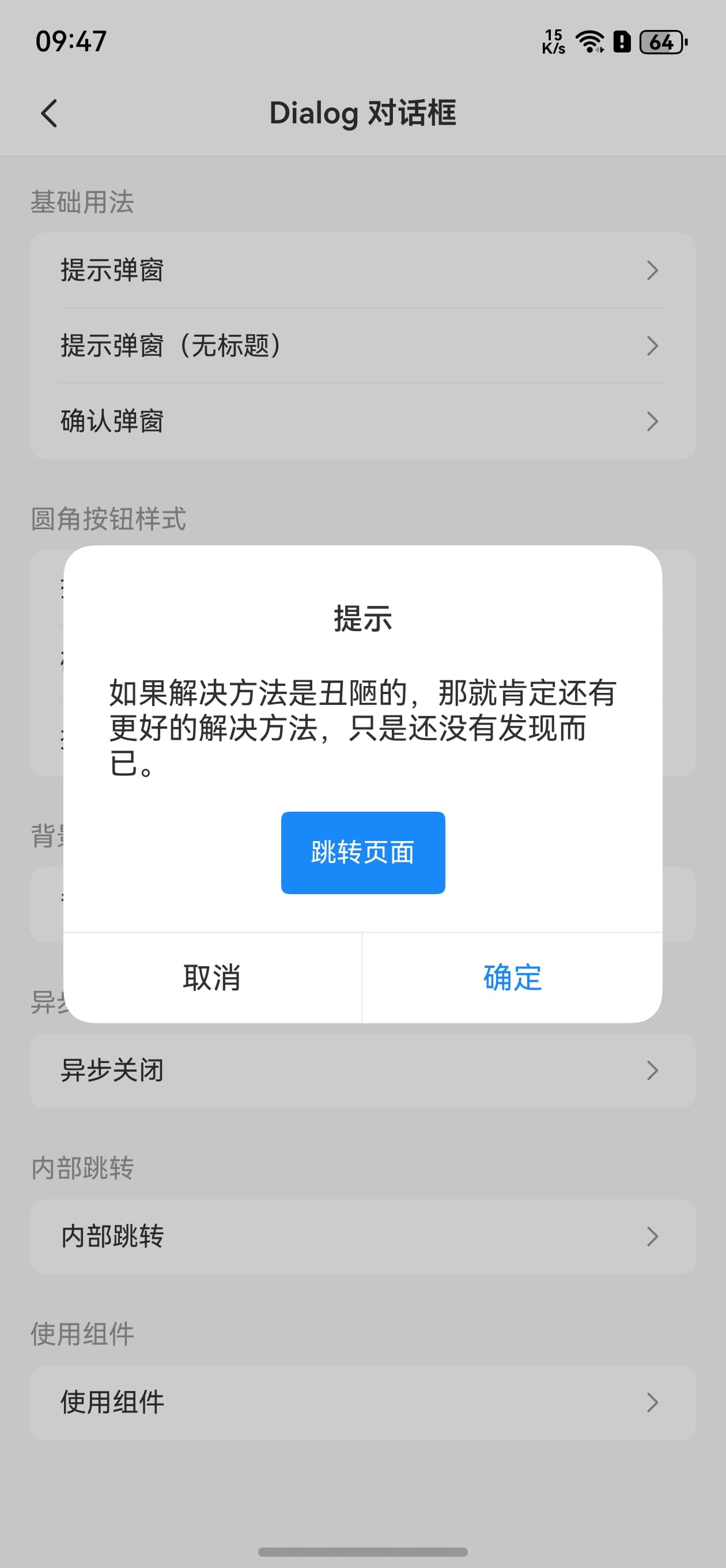
}内部跳转
点我查看代码
ts
@Entry
@Component
struct DemoPage {
@State uniId: number = 0
private uiContext = this.getUIContext()
@Builder customComponentContent() {
Column({space: 20}){
Text("如果解决方法是丑陋的,那就肯定还有更好的解决方法,只是还没有发现而已。")
IBestButton({
type: 'primary',
text: "跳转页面",
onBtnClick: () => {
router.pushUrl({
url: "pages/base/Button",
params: {
title: "Button 按钮"
}
})
}
})
}
.padding(20)
}
onDidBuild(): void {
setTimeout(() => {
let uniId = this.uiContext.getAttachedFrameNodeById("main")?.getUniqueId()
if(uniId){
this.uniId = uniId
}
}, 50)
}
build(){
Column(){
IBestButton({
text: '打开弹窗',
type: 'primary',
onBtnClick: () => {
IBestDialogUtil.open({
title: textData.title,
message: textData.life,
showCancelButton: true,
levelMode: 1,
levelUniqueId: this.uniId,
defaultBuilder: (): void => this.customComponentContent()
})
}
})
}
.id("main")
}
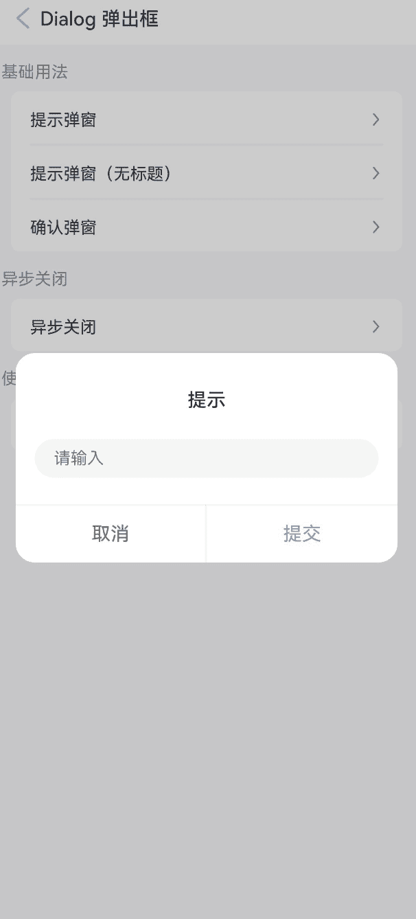
}使用Dialog组件
点我查看代码
ts
@Entry
@Component
struct DemoPage {
  @State inputValue: string = ''
  @State formInputError: boolean = false
  @State dialogVisible: boolean = false
  @State dialogWidth: string = "90%"
  @Builder formInputContain() {
    Column({ space: 20 }) {
      IBestButton({
        type: 'primary',
        text: "切换宽度",
        onBtnClick: () => {
          this.dialogWidth = this.dialogWidth === "90%" ? "80%" : "90%"
        }
      })
      TextInput({ placeholder: '请输入' })
        .onChange(value => {
          this.inputValue = value
          this.formInputError = false
        })
      if (this.formInputError) {
        Text('不能为空')
          .width("100%")
          .textAlign(TextAlign.Start)
          .fontColor(Color.Red)
          .fontSize(12)
      }
    }.padding(20)
  }
  build(){
    Column(){
      IBestDialog({
        visible: $dialogVisible,
        title: "提示",
        showCancelButton: true,
        defaultBuilder: (): void => this.formInputContain(),
        beforeClose: (action) => {
          if (action === 'cancel') {
            return true
          }
          const valueLength = this.inputValue.trim().length
          this.formInputError = !valueLength
          return !this.formInputError
        }
      })
      IBestButton({
        text: '打开弹窗',
        type: 'primary',
        onBtnClick: () => {
          this.dialogVisible = true
        }
      })
    }
  }
}
API
IBestDialogUtil 方法
| 方法名 | 说明 | 参数 | 返回值 |
|---|---|---|---|
| open | 展示, 返回当前弹窗id | option: IBestDialogOption | Promise<string> |
| close | 关闭 | id?: string | void |
IBestDialog @Props & IBestDialogOption 数据结构
TIP
visible 只有 IBestDialog 可用。
| 参数 | 说明 | 类型 | 默认值 |
|---|---|---|---|
| visible | 弹窗是否可见, 支持双向绑定 | boolean | false |
| dialogWidth | 弹窗的宽度 | string | number | 320 |
| dialogBorderRadius | 弹窗的圆角 | Length | BorderRadiuses | LocalizedBorderRadiuses | 16 |
| bgImage | 弹框背景图片 | ResourceStr | '' |
| bgColor | 弹框背景颜色 | ResourceColor | #fff |
| title | 弹窗的标题 | ResourceStr | `` |
| titleColor | 弹窗的标题文字颜色 | ResourceColor | #323233 |
| titleFontSize | 标题的文字大小 | string | number | 16 |
| titlePaddingTop | 弹窗的标题的上内边距 | string | number | 26 |
| titlePaddingX | 标题的左右内边距 | string | number | 24 |
| titleLienHeight | 标题的行高 | string | number | 24 |
| titleTextAlign | 标题的对齐方式 | 'left' | 'center' | 'right' | center |
| message | 弹窗的内容区域文本 | ResourceStr | '' |
| messageFontColor | 弹窗的内容文字颜色 | ResourceColor | #323233 |
| messageFontSize | 弹窗的内容文字大小 | string | number | 14 |
| messageLineHeight | 弹窗的内容区域文字行高 | string | number | 20 |
| messagePaddingTop | 弹窗的内容区域的上内边距 | string | number | 8 |
| messagePaddingX | 弹窗的内容区域的左右内边距 | string | number | 24 |
| messagePaddingXBottom | 弹窗的内容区域的下内边距 | string | number | 26 |
| messageTextAlign | 弹窗的内容区域的文字对齐方式 | left | center | right | center |
| messageMaxHeight | 弹窗的内容区域的滚动区域最大高度 | string | number | auto |
| theme | 按钮样式风格,可选值 default round-button | string | default |
| buttonSpace | 按钮间距 | string | number | 0 |
| showConfirmButton | 是否展示确认按钮 | boolean | true |
| showCancelButton | 是否展示取消按钮 | boolean | false |
| confirmButtonText | 确认按钮文案 | ResourceStr | 确认 |
| cancelButtonText | 取消按钮的文案 | ResourceStr | 取消 |
| buttonFontSize | 按钮文字大小 | string | number | 16 |
| confirmButtonColor | 确认按钮的文字颜色, 当 theme 为 round-button 时默认为 #fff | ResourceColor | #3D8AF2 |
| confirmButtonBgColor | 确认按钮背景色, 当 theme 为 round-button 时默认为 #3D8AF2 | ResourceColor | #fff |
| cancelButtonColor | 取消按钮的文字颜色 | ResourceColor | #646566 |
| cancelButtonBgColor | 取消按钮背景色 | ResourceColor | #fff |
| confirmButtonDisabled | 是否禁用确认按钮 | boolean | false |
| cancelButtonDisabled | 是否禁用取消按钮 | boolean | false |
| showOverlay | 是否展示遮罩层 | boolean | true |
| overlayColor | 遮罩层颜色 | ResourceColor | 0x33000000 |
| showInSubWindow | 某弹框需要显示在主窗口之外时,是否在子窗口显示此弹窗 | boolean | false |
| closeOnClickOverlay | 是否允许点击遮罩层关闭 | boolean | false |
| closeOnBackPress | 是否允许返回键关闭 | boolean | true |
| alignment | 弹窗在竖直方向上的对齐方式, 可选值 top center bottom | string | center |
| offsetX | 弹窗相对alignment所在位置的横向偏移量 | string | number | 0 |
| offsetY | 弹窗相对alignment所在位置的纵向偏移量 | string | number | 0 |
| keyboardAvoidMode | 设置弹窗是否在拉起软键盘时进行自动避让 | KeyboardAvoidMode | DEFAULT |
| keyboardAvoidDistance | 弹窗避让键盘后,和键盘之间的距离 | LengthMetrics | 16vp |
| levelMode | 弹窗显示层级 | LevelMode | 0 |
| levelUniqueId | 页面级弹窗需要显示的层级下的节点 uniqueId, 仅当levelMode属性设置为LevelMode.EMBEDDED时生效 | number | - |
| confirmButtonFontWeight | 确认按钮的文字字重 | FontWeight | Normal |
| beforeClose | 关闭前的回调函数,返回 false 可阻止关闭,支持返回 Promise | (action: cancel | confirm) => Promise<boolean> | boolean | - |
Events
| 事件名 | 说明 | 事件类型 |
|---|---|---|
| onOpen | 打开弹窗的回调 | () => void |
| onClose | 关闭弹窗的回调 | () => void |
| onCancel | 点击取消按钮的回调 | () => void |
| onConfirm | 点击确认按钮的回调 | () => void |
插槽
| 插槽名 | 说明 | 类型 |
|---|---|---|
| titleBuilder | 标题的插槽,优先级大于 title 属性 | CustomBuilder |
| defaultBuilder | 内容的插槽,优先级大于 message 属性 | CustomBuilder |
| footerBuilder | 底部按钮部分的插槽 | CustomBuilder |
主题定制
组件提供了下列颜色变量,可用于自定义深色/浅色模式样式,使用方法请参考 颜色模式 章节,如需要其它颜色变量可提 issue。
| 名称 | 描述 | 默认值 |
|---|---|---|
| ibest_dialog_background | 背景颜色 | #fff |
| ibest_dialog_title_color | 标题文字颜色 | #323233 |
| ibest_dialog_message_color | 提示信息文字颜色 | #323233 |
| ibest_dialog_cancel_text_color | 取消按钮文字颜色 | #323233 |
| ibest_dialog_border_color | 边框颜色 | #ebedf0 |