Loading 加载
介绍
加载图标,用于表示加载中的过渡状态。
TIP
阅读该组件文档前请确保已认真阅读快速上手章节的每一个字。
引入
ts
import { IBestLoading } from "@ibestservices/ibest-ui";代码演示
加载类型
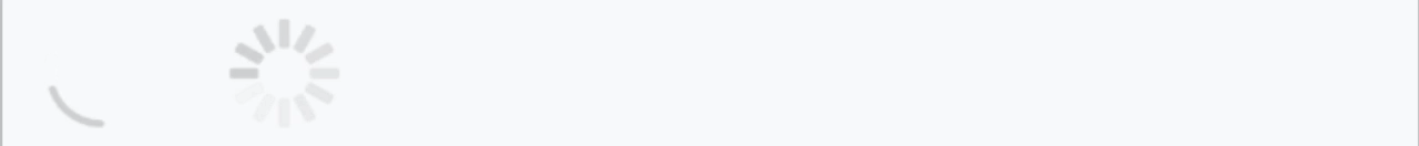
TIP
通过 loadingIconType 属性可以设置加载图标的类型,默认为 circular,可选值为 spinner。
点我查看代码
ts
@Entry
@Component
struct DemoPage {
  build() {
    Row({space: 20}) {
      IBestLoading()
      IBestLoading({
        loadingIconType: "spinner"
      })
    }
  }
}
自定义颜色
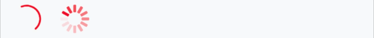
TIP
通过 loadingColor 属性设置加载图标的颜色。
点我查看代码
ts
@Entry
@Component
struct DemoPage {
  build() {
    Row({space: 20}) {
      IBestLoading({
        loadingColor: "rgb(25, 137, 250)",
      })
      IBestLoading({
        loadingColor: "rgb(25, 137, 250)",
        loadingIconType: "spinner",
      })
    }
  }
}
自定义大小
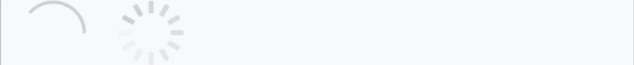
TIP
通过 loadingSize 属性设置加载图标的大小,默认值为 60px 。
点我查看代码
ts
@Entry
@Component
struct DemoPage {
build() {
Row({space: 20}) {
IBestLoading({
loadingSize: 40
})
IBestLoading({
loadingSize: 40,
loadingIconType: "spinner"
})
}
}
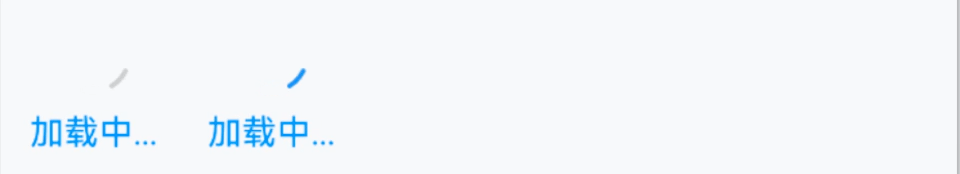
}加载文案
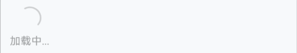
TIP
可以使用 loadingText 属性在图标的下方插入加载文案。
点我查看代码
ts
@Entry
@Component
struct DemoPage {
build() {
Column(){
IBestLoading({
loadingText: "加载中..."
})
}
}
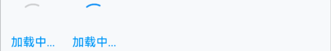
}水平排列
TIP
设置 vertical 属性为 false 后,图标和文案会垂直排列。
点我查看代码
ts
@Entry
@Component
struct DemoPage {
  build() {
    Column(){
      IBestLoading({
        loadingText: "加载中...",
        vertical: false
      })
    }
  }
}
自定义文本颜色
TIP
通过 loadingTextColor 属性设置加载文案的颜色。
点我查看代码
ts
@Entry
@Component
struct DemoPage {
  build() {
    Column(){
      IBestLoading({
        loadingText: "加载中...",
        loadingColor: "rgb(25, 137, 250)",
        loadingTextColor: "rgb(25, 137, 250)"
      })
      IBestLoading({
        loadingText: "加载中...",
        loadingTextColor: "rgb(25, 137, 250)"
      })
    }
  }
}
包含内容

TIP
通过 defaultBuilder 传入自定义内容
点我查看代码
ts
import { IBestEmpty } from '@ibestservices/ibest-ui'
@Entry
@Component
struct LoadingPage {
  @Builder EmptyContain() {
    IBestEmpty()
  }
  build(){
    Column(){
      IBestLoading({
        defaultBuilder: (): void => this.EmptyContain(),
        loadingMaskColor: 'rgba(0,0,0,0.5)',
        loadingColor: 'rgb(25, 137, 250)'
      })
    }
  }
}
API
@Props
| 参数 | 说明 | 类型 | 默认值 |
|---|---|---|---|
| loadingIconType | 类型,可选值为 spinner | string | circular |
| loadingText | 加载的文案 | ResourceStr | '' |
| loadingSize | 加载图标大小 | string | number | 30 |
| loadingColor | loading 的颜色 | ResourceColor | #c8c9cc |
| loadingTextColor | loading 的文字颜色 | ResourceColor | #c8c9cc |
| loadingTextFontSize | loading 的文字内容大小 | string | number | 14 |
| loadingStrokeWidth | loading 图形的线条宽度 | Length | 2 |
| loadingMaskColor | loading 的遮罩颜色 | ResourceColor | transparent |
| spinnerStrokeHeight | spinner 图的每条线的长度 | string | number | 8 |
| vertical | 是否垂直排列图标和文字内容 | boolean | false |
| space | 图标与文字间距 | string | number | 8 |
插槽
| 插槽名 | 说明 | 类型 |
|---|---|---|
| defaultBuilder | loading 包裹的组件插槽 | CustomBuilder |
| loadingIconBuilder | loading 的图标插槽 | CustomBuilder |
| loadingTextBuilder | loading 的文案插槽 | CustomBuilder |