SideBar 侧边导航
介绍
垂直展示的导航栏,用于在不同的内容区域之间进行切换。
TIP
阅读该组件文档前请确保已认真阅读快速上手章节的每一个字。
引入
ts
import { IBestSideBar, IBestSideBarItem } from "@ibestservices/ibest-ui";代码演示
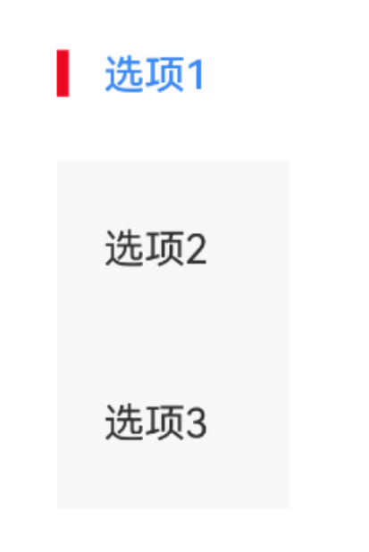
基础用法

点我查看代码
ts
@Entry
@Component
struct DemoPage {
  @State groupId: string = "group"
  @State active: number = 0
  @State itemList: Array<string> = ["选项1", "选项2", "选项3"]
  build() {
    Column(){
      IBestSideBar({
        groupId: this.groupId,
        active: $active
      }){
        ForEach(this.itemList, (item: string, index) => {
          IBestSideBarItem({
            groupId: this.groupId,
            index: index,
            title: item
          })
        })
      }
    }
  }
}
自定义样式
点我查看代码
ts
@Entry
@Component
struct DemoPage {
@State groupId: string = "group"
@State active: number = 0
@State itemList: Array<string> = ["选项1", "选项2", "选项3"]
build() {
Column(){
IBestSideBar({
groupId: this.groupId,
active: $active,
leftBarColor: "#ee0a24",
activeFontColor: "#3d8af2"
}){
ForEach(this.itemList, (item: string, index) => {
IBestSideBarItem({
groupId: this.groupId,
index: index,
title: item
})
})
}
}
}
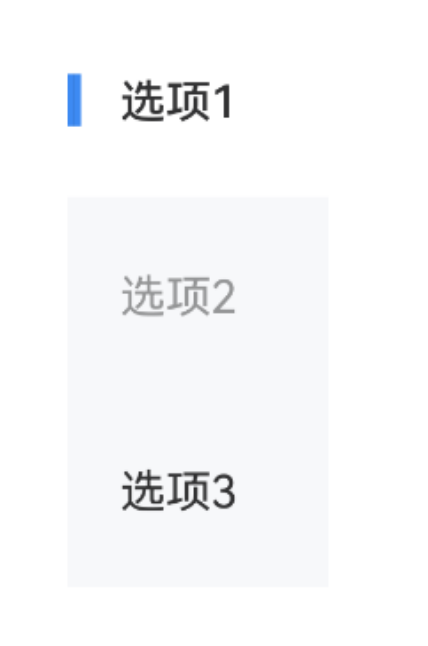
}禁用选项
点我查看代码
ts
@Entry
@Component
struct DemoPage {
@State groupId: string = "group"
@State active: number = 0
@State itemList: Array<string> = ["选项1", "选项2", "选项3"]
build() {
Column(){
IBestSideBar({
groupId: this.groupId,
active: $active
}){
ForEach(this.itemList, (item: string, index) => {
IBestSideBarItem({
groupId: this.groupId,
index: index,
title: item,
disabled: index == 1
})
})
}
}
}
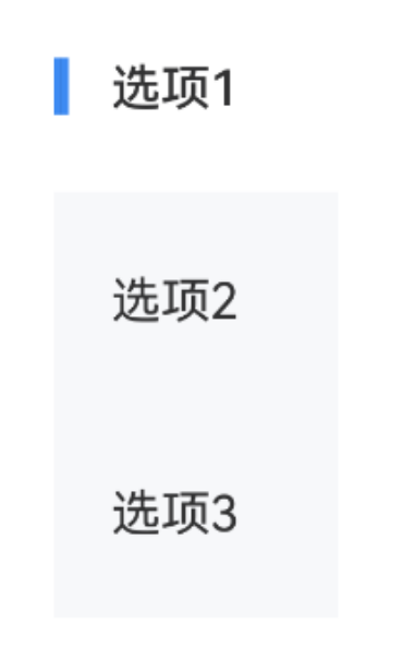
}切换事件
点我查看代码
ts
@Entry
@Component
struct DemoPage {
  @State groupId: string = "group"
  @State active: number = 0
  @State itemList: Array<string> = ["选项1", "选项2", "选项3"]
  build() {
    Column(){
      IBestSideBar({
        groupId: this.groupId,
        active: $active,
        onChange: (index: number) => {
          console.log(this.itemList[index])
        }
      }){
        ForEach(this.itemList, (item: string, index) => {
          IBestSideBarItem({
            groupId: this.groupId,
            index: index,
            title: item
          })
        })
      }
    }
  }
}
API
IBestSideBar @Props
| 参数 | 说明 | 类型 | 默认值 |
|---|---|---|---|
| groupId | 分组id | string | number | '' |
| active | 当前导航项的索引 | number | 0 |
| sideWidth | 宽度 | string | number | 80 |
| maxHeight | 最大高度 | string | number | '' |
| titleColor | 文字颜色 | ResourceColor | #323233 |
| titleFontSize | 文字大小 | string | number | 14 |
| bgColor | 背景色 | ResourceColor | #f7f8fa |
| activeBgColor | 激活项背景色 | ResourceColor | #fff |
| showLeftBar | 是否显示左侧颜色条 | boolean | true |
| leftBarSize | 左侧颜色条尺寸 | LeftBarSize | {width: 4, height: 16} |
| leftBarColor | 左侧颜色条颜色 | ResourceColor | #3d8af2 |
| activeFontColor | 激活项文字颜色 | ResourceColor | #323232 |
| activeFontWeight | 激活项文字字重 | FontWeight | Medium |
LeftBarSize 数据类型
| 属性名 | 说明 | 类型 | 默认值 |
|---|---|---|---|
| width | 宽度 | string | number | 4 |
| height | 高度 | string | number | 16 |
IBestSideBar 插槽
| 插槽名 | 说明 | 类型 |
|---|---|---|
| defaultBuilder | 默认内容 | CustomBuilder |
IBestSideBar Events
| 事件名 | 说明 | 事件类型 |
|---|---|---|
| onChange | 切换事件回调 | (index: number) => void |
IBestSideBarItem @Props
| 参数 | 说明 | 类型 | 默认值 |
|---|---|---|---|
| groupId | 分组id, 与IBestSideBar groupId 一致 | string | number | '' |
| index | 索引 | number | 0 |
| title | 选项文字 | ResourceStr | '' |
| disabled | 是否禁用 | boolean | false |
| contentPadding 2.2.0 | 内边距 | Length | Padding | LocalizedPadding | {top:20, bottom:20, right:12} |
IBestSideBarItem 插槽
| 插槽名 | 说明 | 类型 |
|---|---|---|
| defaultBuilder | 默认内容 | CustomBuilder |
IBestSideBarItem Events
| 事件名 | 说明 | 事件类型 |
|---|---|---|
| onItemClick | 选项点击回调 | (index: number) => void |
主题定制
组件提供了下列颜色变量,可用于自定义深色/浅色模式样式,使用方法请参考 颜色模式 章节,如需要其它颜色变量可提 issue。
| 名称 | 描述 | 默认值 |
|---|---|---|
| ibest_sidebar_background | 背景色 | #f7f8fa |