Switch 开关
介绍
用于在打开和关闭状态之间进行切换。
TIP
阅读该组件文档前请确保已认真阅读快速上手章节的每一个字。
引入
ts
import { IBestSwitch } from "@ibestservices/ibest-ui";代码演示
基础用法
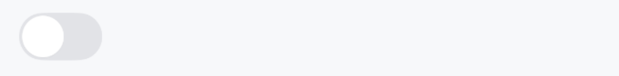
TIP
通过 value 来设置开关的状态,通过 onChange 监听状态变化。
点我查看代码
ts
@Entry
@Component
struct DemoPage {
@State value: boolean = false
build() {
Column(){
IBestSwitch({
value: $value
})
}
}
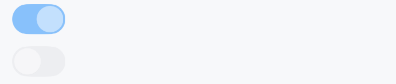
}自定义尺寸
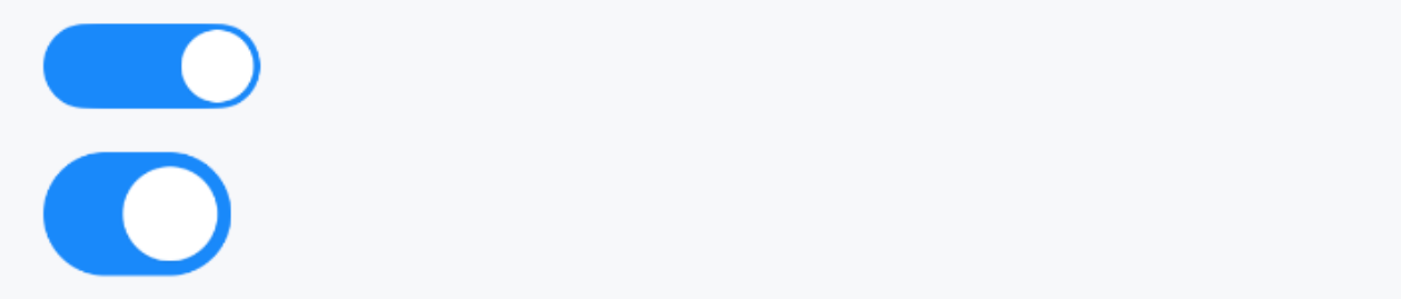
TIP
通过 switchSize 属性自定义开关的大小。
点我查看代码
ts
@Entry
@Component
struct DemoPage {
  @State value: boolean = true
  build() {
    Column({space: 20}){
      IBestSwitch({
        value: $value,
        switchSize: 20,
        componentWidth: 60
      })
      IBestSwitch({
        value: $value,
        componentPadding: 4
      })
    }
  }
}
文字图标
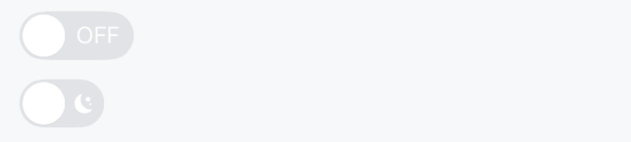
点我查看代码
ts
@Entry
@Component
struct DemoPage {
@State value: boolean = true
build() {
Column({space: 20}){
IBestSwitch({
value: $value,
inactiveText: "OFF",
activeText: "ON",
componentWidth: 70
})
IBestSwitch({
value: $value,
inactiveIcon: $r("app.media.icon_dark"), // 替换为自己项目图片
activeIcon: $r("app.media.icon_light"), // 替换为自己项目图片
activeTextColor: "#f0ff86"
})
}
}
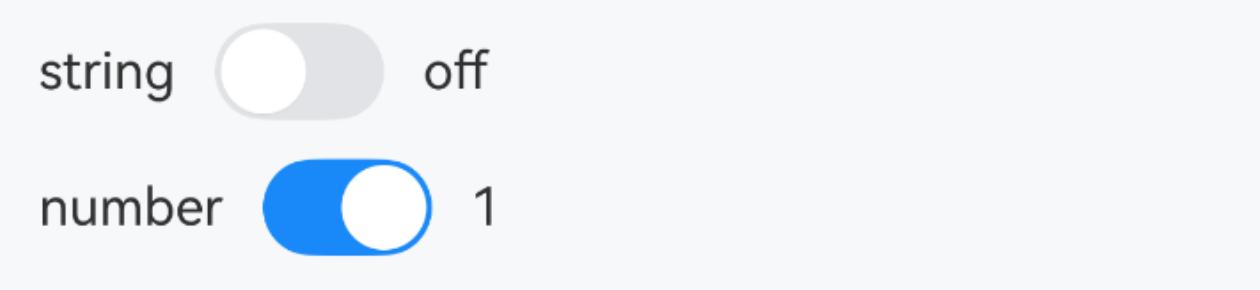
}扩展value类型
点我查看代码
ts
@Entry
@Component
struct DemoPage {
  @State stringValue: string = 'off'
  @State numberValue: number = 1
  build() {
    Column({space: 20}){
      Row({space: 14}){
        Text("string")
        IBestSwitch({
          value: $stringValue,
          inactiveValue: "off",
          activeValue: "on"
        })
        Text(this.stringValue)
      }
      Row({space: 14}){
        Text("number")
        IBestSwitch({
          value: $numberValue,
          inactiveValue: 0,
          activeValue: 1
        })
        Text(this.numberValue.toString())
      }
    }
  }
}
禁用状态
TIP
通过 disabled 属性来禁用开关,禁用状态下开关不可点击。
点我查看代码
ts
@Entry
@Component
struct DemoPage {
  @State value1: boolean = true
  @State value2: boolean = false
  build() {
    Column({space: 14}){
      IBestSwitch({
        value: $value1,
        disabled: true
      })
      IBestSwitch({
        value: $value2,
        disabled: true
      })
    }
  }
}
加载状态
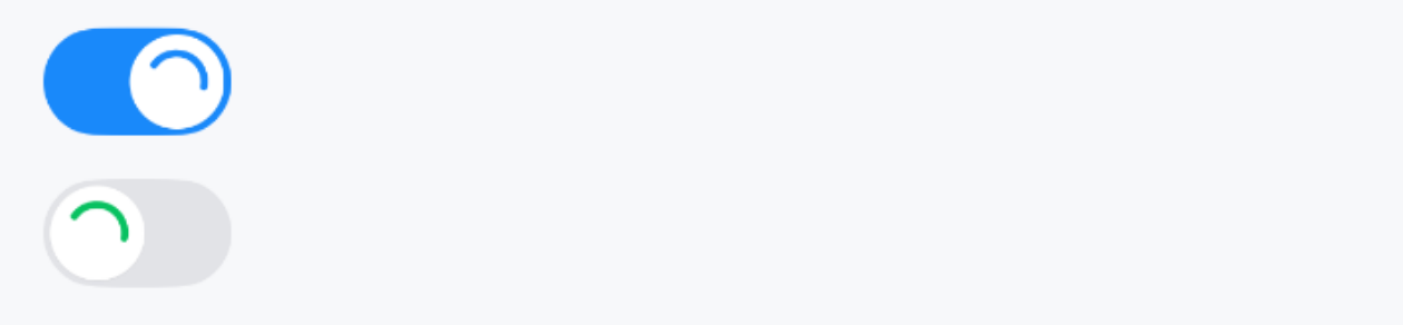
TIP
通过 loading 属性来禁用开关,加载状态下开关不可点击。
点我查看代码
ts
@Entry
@Component
struct DemoPage {
  @State value1: boolean = true
  @State value2: boolean = false
  build() {
    Column({space: 14}){
      IBestSwitch({
        value: $value1,
        loading: true
      })
      IBestSwitch({
        value: $value2,
        loading: true,
        activeColor: '#07c160'
      })
    }
  }
}
自定义按钮
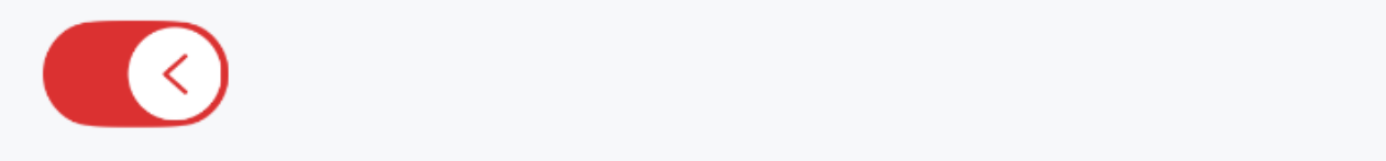
TIP
通过 nodeBuilder 插槽自定义按钮的内容。
点我查看代码
ts
@Entry
@Component
struct DemoPage {
  @State value: boolean = true
  @State arrowDirection: 'left' | 'right' = 'left'
  @Builder Arrow(){
    Row(){
      Image($r('app.media.arrow'))
        .width(15)
        .fillColor(this.arrowDirection === 'left' ? '#db3131' : '#e2e3e7')
        .rotate({
          angle: this.arrowDirection === 'left' ? 0 : -180
        }).animation({
          duration: 200
        })
    }
  }
  build(){
    Column(){
      IBestSwitch({
        value: $value,
        activeColor: '#db3131',
        nodeBuilder: () => this.Arrow(),
        onChange: value => {
          this.arrowDirection = value ? 'left' : 'right'
        }
      })
    }
  }
}
异步控制
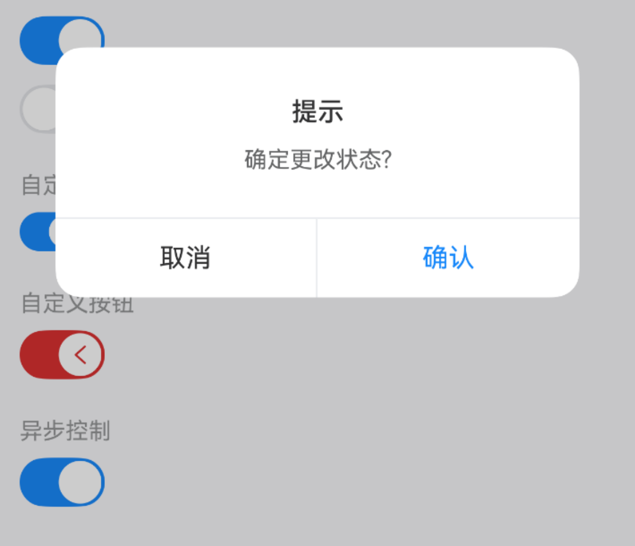
TIP
在 onBeforeChange 事件的回调函数中返回Promise<false>或false, 可阻止按钮状态的变化。
点我查看代码
ts
@Entry
@Component
struct DemoPage {
  @State value: boolean = true
  build() {
    Column(){
      IBestSwitch({
        value: $value,
        onBeforeChange: () => {
          return new Promise((resolve, reject) => {
            IBestDialogUtil.open({
              title: "提示",
              message: "确定更改状态?",
              showCancelButton: true,
              onConfirm: () => {
                resolve()
              },
              onCancel: () => {
                reject()
              }
            })
          })
        }
      })
    }
  }
}
API
@Props
| 参数 | 说明 | 类型 | 默认值 |
|---|---|---|---|
| value | 默认是否选中, 支持双向绑定, 2.2.0 开始支持string、number类型 | boolean | string | number | false |
| disabled | 是否禁用按钮 | boolean | false |
| loading | 是否显示为加载状态 | boolean | false |
| switchSize | 大小尺寸 | string | number | 26 |
| activeColor | 打开时的背景色 | ResourceColor | #1989fa |
| inactiveColor | 关闭时的背景色 | ResourceColor | #e2e3e7 |
| loadingActiveColor | 打开时的 loading 颜色,默认跟随 activeColor | ResourceColor | '' |
| loadingInactiveColor | 关闭时的 loading 颜色,默认跟随 activeColor | ResourceColor | '' |
| componentWidth 2.2.0 | 组件宽度 | string | number | '' |
| componentPadding 2.2.0 | 组件内边距 | string | number | 2 |
| activeText 2.2.0 | 打开时的文字内容 | ResourceStr | '' |
| inactiveText 2.2.0 | 关闭时的文字内容 | ResourceStr | '' |
| activeIcon 2.2.0 | 打开时的图标, 优先级高于activeText | ResourceStr | '' |
| inactiveIcon 2.2.0 | 关闭时的图标, 优先级高于inactiveText | ResourceStr | '' |
| textFontSize 2.2.0 | 文字/图片大小 | string | number | 14 |
| activeTextColor 2.2.0 | 打开时的文字/图标颜色 | ResourceColor | #fff |
| inactiveTextColor 2.2.0 | 关闭时的文字/图标颜色 | ResourceColor | #fff |
| activeValue 2.2.0 | 打开时的值 | boolean | string | number | true |
| inactiveValue 2.2.0 | 关闭时的值 | boolean | string | number | false |
Events
| 事件名 | 说明 | 事件类型 |
|---|---|---|
| onChange | 开关状态改变的回调事件 | (value: boolean | string | number) => void |
| onBeforeChange | 开关状态改变前的回调事件, value 为将要改变的状态, 返回Promise<false>或false, 可阻止按钮状态的变化。 | (value: boolean) => Promise<boolean> | boolean |
| onSwitchClick | 点击开关的回调事 | () => void |
插槽
| 插槽名 | 说明 | 类型 |
|---|---|---|
| nodeBuilder | 自定义按钮的内容 | CustomBuilder |
主题定制
组件提供了下列颜色变量,可用于自定义深色/浅色模式样式,使用方法请参考 颜色模式 章节,如需要其它颜色变量可提 issue。
| 名称 | 描述 | 默认值 |
|---|---|---|
| ibest_switch_background | 关闭时的背景色 | #e2e3e7 |